Healthcare

Enterprise Product

Under NDA

Unifying scientific discovery and collaboration

Unifying scientific discovery and collaboration

Unifying scientific discovery and collaboration

Unifying scientific discovery and collaboration

A digital workspace that holds scientific search, AI-assisted investigation and knowledge organisation on one surface.

A digital workspace that holds scientific search, AI-assisted investigation and knowledge organisation on one surface.

A digital workspace that holds scientific search, AI-assisted investigation and knowledge organisation on one surface.

A digital workspace that holds scientific search, AI-assisted investigation and knowledge organisation on one surface.

Role

Senior Product Designer

Disciplines

Product Design, UX, UI and Prototyping

Client

Global pharmaceutical R&D

Platform

Web

01

Overview

Overview

Overview

The platform combines advanced search, AI-assisted chat and collection management within one web application. Users can search across structured scientific records, continue their investigation through AI-supported conversations and organise relevant findings into collections.

I led the product design for the platform, turning complex research activities and product requirements into one consistent experience.

02

Challenge

Challenge

Challenge

Research users were relying on separate tools to search, explore, discuss and organise scientific information.

This fragmented experience made it more difficult to move between activities, maintain context and share relevant knowledge across teams. Users often had to repeat steps or move information manually between different systems.
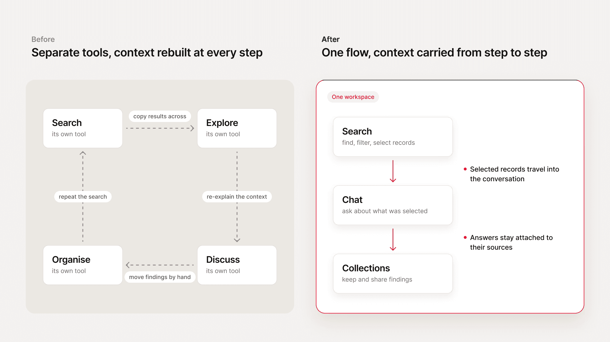

Diagram. Before: search, explore, discuss and organise were separate tools, joined by manual hand-offs. After: search, chat and collections form one flow in one workspace, with selected records and sources carried along.

The product had to balance several requirements:

  • Provide a unified experience without oversimplifying the research process

  • Maintain clarity across search, chat and collection workflows

  • Help users understand the relationship between AI-generated responses and their supporting sources

  • Support structured scientific records and detailed metadata

  • Create reusable interaction patterns for future product capabilities

  • Respect technical, organisational and confidentiality constraints


03

Process

Process

Process

I drew the information architecture before anything else, and what came out had two audiences, not three capabilities: five areas for researchers, and an admin side behind them (user and facet management, announcements, maintenance mode). I had to settle that first, because a researcher's filters are an admin's facets. Someone has to manage those before anyone can filter.
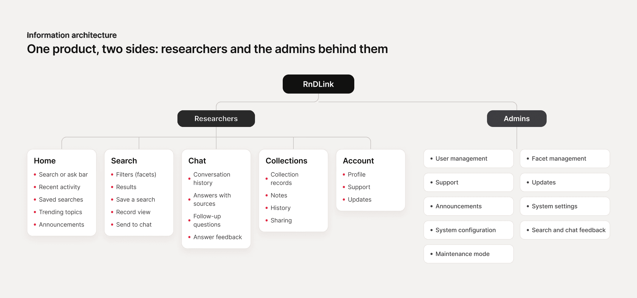
Information architecture. Researchers: Home, Search, Chat, Collections and Account. Admins: user and facet management, support, updates, announcements, settings, configuration, feedback and maintenance mode.

Then I worked through the product epic by epic, writing the behaviour beside each screen instead of in a separate document: what stays in the search box until it is cleared, when bulk actions appear, which filters hide when empty. Questions I couldn't answer sat on the board in a different colour until someone did.
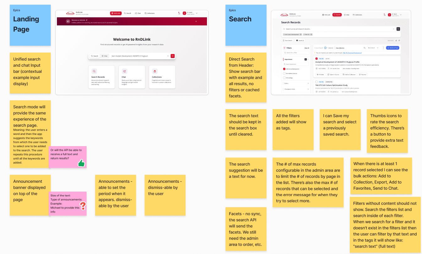
An annotated epic board: two screens surrounded by notes setting the behaviour — what stays in the search box until it is cleared, when bulk actions appear, which filters hide when empty — with the open questions marked in a different colour

The board settled what a screen could settle.

04

Decisions

Decisions

Decisions

Search and chat as one activity, not two tools

Search and chat as one activity, not two tools

Search and chat as one activity, not two tools

The Tension

The platform was scoped as three capabilities: search, AI chat and collections. Building them as three connected but separate areas was faster and matched how the engineering work was already divided. Treating them as one continuous activity meant changing the product model, not the layout.

The platform was scoped as three capabilities: search, AI chat and collections. Building them as three connected but separate areas was faster and matched how the engineering work was already divided. Treating them as one continuous activity meant changing the product model, not the layout.

What I chose

Search and chat became one flow rather than two areas that link to each other. What a researcher loses in the gap between them is the part that matters: the filters they narrowed by, the records they picked, and the reason they picked them. A link carries none of that across.

Search and chat became one flow rather than two areas that link to each other. What a researcher loses in the gap between them is the part that matters: the filters they narrowed by, the records they picked, and the reason they picked them. A link carries none of that across.

What it required

The handover had to be designed, not assumed. Selection state, source context and filters all had to survive the move from search into conversation, which meant designing the seam between the two rather than designing two surfaces and joining them later.

The handover had to be designed, not assumed. Selection state, source context and filters all had to survive the move from search into conversation, which meant designing the seam between the two rather than designing two surfaces and joining them later.

AI answers stay attached to their evidence

AI answers stay attached to their evidence

AI answers stay attached to their evidence

The Tension

The prevailing AI pattern is a single confident answer, and it's the pattern users arrive expecting. In regulated scientific work an answer that cannot be traced is an answer that cannot be used, because the researcher has to be able to defend where it came from.

The prevailing AI pattern is a single confident answer, and it's the pattern users arrive expecting. In regulated scientific work an answer that cannot be traced is an answer that cannot be used, because the researcher has to be able to defend where it came from.

What I chose

Every response sits beside the records it drew from. The interface never asks for trust it cannot substantiate.

Every response sits beside the records it drew from. The interface never asks for trust it cannot substantiate.

What it cost

Density. The answer cannot stand alone, so the layout carries supporting material that a consumer product would hide.

Density. The answer cannot stand alone, so the layout carries supporting material that a consumer product would hide.

Patterns defined as rules, not as screens

Patterns defined as rules, not as screens

Patterns defined as rules, not as screens

The Tension

The review conversation kept landing on screens and colour while the product needed a system. Every session spent on visual detail was a session not spent on the rules that would let the team add new research workflows later, and the pressure ran that way by default.

The review conversation kept landing on screens and colour while the product needed a system. Every session spent on visual detail was a session not spent on the rules that would let the team add new research workflows later, and the pressure ran that way by default.

What I chose

I defined navigation and interaction patterns as reusable rules, so the team could add new workflows without redesigning the shell.

I defined navigation and interaction patterns as reusable rules, so the team could add new workflows without redesigning the shell.

What it cost

Time. Getting agreement on a system took repeated rounds of pulling the conversation back from visual detail, and that argument had to be won before the structural work could be trusted.

Time. Getting agreement on a system took repeated rounds of pulling the conversation back from visual detail, and that argument had to be won before the structural work could be trusted.

Colour could not carry the meaning on its own

Colour could not carry the meaning on its own

Colour could not carry the meaning on its own

The Tension

Colour is the fastest way to separate a primary action from a secondary one, and in a dense research interface it is the separation that costs no space. Accessibility ruled it out as the only signal: someone who is colour-blind has to tell the two apart without seeing a difference in hue.

Colour is the fastest way to separate a primary action from a secondary one, and in a dense research interface it is the separation that costs no space. Accessibility ruled it out as the only signal: someone who is colour-blind has to tell the two apart without seeing a difference in hue.

What I chose

The label carries the action and the icon repeats it, so what a control does is readable before its colour is. Weight, fill and position hold the hierarchy, not hue alone, and every action had to be named in words a reader understands without being taught them.

The label carries the action and the icon repeats it, so what a control does is readable before its colour is. Weight, fill and position hold the hierarchy, not hue alone, and every action had to be named in words a reader understands without being taught them.

What it cost

Range. The client wanted something that did not look like the other applications they had: more colour, more obviously modern. Accessibility capped how far that could go, and I spent the difference arguing that an interface doesn't need to be colourful to be good. It made friction with the people whose brief I was partly refusing. They were glad of it by the end, which is not the same as it having been free.

Range. The client wanted something that did not look like the other applications they had: more colour, more obviously modern. Accessibility capped how far that could go, and I spent the difference arguing that an interface doesn't need to be colourful to be good. It made friction with the people whose brief I was partly refusing. They were glad of it by the end, which is not the same as it having been free.

05

Solution

Solution

Solution

This app brings scientific discovery, AI-assisted investigation and knowledge organisation into one connected workspace. Search, chat and collections are one surface.

Admin panel: facet management and search and chat feedback
One record card component shown in its compact, loading, expanded and collapsed versions

Password: andreduarte2026 · Opens in Figma

06

Validation

Validation

Validation

HOW IT WAS REVIEWED

Continuous review with the stakeholder group, who were also the platform's users. Feedback came during working sessions rather than afterwards, so I made UX changes against their reactions in the same cycle.

Continuous review with the stakeholder group, who were also the platform's users. Feedback came during working sessions rather than afterwards, so I made UX changes against their reactions in the same cycle.

WHAT SHIPPED

Research, design system and mockups handed to the implementation team. Live.

Research, design system and mockups handed to the implementation team. Live.

07

Outcome

Outcome

Outcome

Search, AI-assisted investigation and knowledge organisation stopped being three separate tools and became one connected experience: records selected in a search carry into the AI conversation with their filters and their sources intact, instead of the researcher rebuilding the same search in a second system.

The work was approved and moved into build. The navigation and interaction patterns I defined became the foundation the team builds new research workflows on.

I have no usage figures. Any the client holds are covered by the agreement.

1

1

1

research flow: search, AI chat and collections in one place

2

2

2

audiences scoped together: researchers, and the admins behind them

08

Reflection

Reflection

Reflection

Simplifying a specialist product does not mean reducing its capability.

The design challenge was to make advanced search, AI and knowledge-management features feel connected and understandable while respecting the complexity of scientific work.

The product needed strong information architecture and clear system feedback, and the AI had to be designed as part of a broader user workflow instead of as an isolated feature.

Consistency across interactions can improve usability for the people using the product and clarity for the teams developing and extending it.

Next Project

Simplifying workplace package tracking and coordination

Let’s build something meaningful.

Open to new challenges, to solving hard problems and to being part of something big. Permanent Lead or Senior Product Designer roles.

LOCATION

Azores, Portugal

LOCAL TIME

15:20AZOST

© 2026 André Duarte

Senior Product Designer

Azores, Portugal

Let’s build something meaningful.

Open to new challenges, to solving hard problems and to being part of something big. Permanent Lead or Senior Product Designer roles.

LOCATION

Azores, Portugal

LOCAL TIME

15:20AZOST

© 2026 André Duarte

Senior Product Designer

Azores, Portugal

Healthcare

Enterprise Product

Under NDA

Unifying scientific discovery and collaboration

Unifying scientific discovery and collaboration

Unifying scientific discovery and collaboration

Unifying scientific discovery and collaboration

A digital workspace that holds scientific search, AI-assisted investigation and knowledge organisation on one surface.

A digital workspace that holds scientific search, AI-assisted investigation and knowledge organisation on one surface.

A digital workspace that holds scientific search, AI-assisted investigation and knowledge organisation on one surface.

A digital workspace that holds scientific search, AI-assisted investigation and knowledge organisation on one surface.

Role

Senior Product Designer

Disciplines

Product Design, UX, UI and Prototyping

Client

Global pharmaceutical R&D

Platform

Web

01

Overview

Overview

Overview

The platform combines advanced search, AI-assisted chat and collection management within one web application. Users can search across structured scientific records, continue their investigation through AI-supported conversations and organise relevant findings into collections.

I led the product design for the platform, turning complex research activities and product requirements into one consistent experience.

02

Challenge

Challenge

Challenge

Research users were relying on separate tools to search, explore, discuss and organise scientific information.

This fragmented experience made it more difficult to move between activities, maintain context and share relevant knowledge across teams. Users often had to repeat steps or move information manually between different systems.


Diagram. Before: search, explore, discuss and organise were separate tools, joined by manual hand-offs. After: search, chat and collections form one flow in one workspace, with selected records and sources carried along.

The product had to balance several requirements:

  • Provide a unified experience without oversimplifying the research process

  • Maintain clarity across search, chat and collection workflows

  • Help users understand the relationship between AI-generated responses and their supporting sources

  • Support structured scientific records and detailed metadata

  • Create reusable interaction patterns for future product capabilities

  • Respect technical, organisational and confidentiality constraints


03

Process

Process

Process

I drew the information architecture before anything else, and what came out had two audiences, not three capabilities: five areas for researchers, and an admin side behind them (user and facet management, announcements, maintenance mode). I had to settle that first, because a researcher's filters are an admin's facets. Someone has to manage those before anyone can filter.

Information architecture. Researchers: Home, Search, Chat, Collections and Account. Admins: user and facet management, support, updates, announcements, settings, configuration, feedback and maintenance mode.

Then I worked through the product epic by epic, writing the behaviour beside each screen instead of in a separate document: what stays in the search box until it is cleared, when bulk actions appear, which filters hide when empty. Questions I couldn't answer sat on the board in a different colour until someone did.

An annotated epic board: two screens surrounded by notes setting the behaviour — what stays in the search box until it is cleared, when bulk actions appear, which filters hide when empty — with the open questions marked in a different colour

The board settled what a screen could settle.

04

Decisions

Decisions

Decisions

Search and chat as one activity, not two tools

Search and chat as one activity, not two tools

Search and chat as one activity, not two tools

The Tension

The platform was scoped as three capabilities: search, AI chat and collections. Building them as three connected but separate areas was faster and matched how the engineering work was already divided. Treating them as one continuous activity meant changing the product model, not the layout.

The platform was scoped as three capabilities: search, AI chat and collections. Building them as three connected but separate areas was faster and matched how the engineering work was already divided. Treating them as one continuous activity meant changing the product model, not the layout.

What I chose

Search and chat became one flow rather than two areas that link to each other. What a researcher loses in the gap between them is the part that matters: the filters they narrowed by, the records they picked, and the reason they picked them. A link carries none of that across.

Search and chat became one flow rather than two areas that link to each other. What a researcher loses in the gap between them is the part that matters: the filters they narrowed by, the records they picked, and the reason they picked them. A link carries none of that across.

What it required

The handover had to be designed, not assumed. Selection state, source context and filters all had to survive the move from search into conversation, which meant designing the seam between the two rather than designing two surfaces and joining them later.

The handover had to be designed, not assumed. Selection state, source context and filters all had to survive the move from search into conversation, which meant designing the seam between the two rather than designing two surfaces and joining them later.

AI answers stay attached to their evidence

AI answers stay attached to their evidence

AI answers stay attached to their evidence

The Tension

The prevailing AI pattern is a single confident answer, and it's the pattern users arrive expecting. In regulated scientific work an answer that cannot be traced is an answer that cannot be used, because the researcher has to be able to defend where it came from.

The prevailing AI pattern is a single confident answer, and it's the pattern users arrive expecting. In regulated scientific work an answer that cannot be traced is an answer that cannot be used, because the researcher has to be able to defend where it came from.

What I chose

Every response sits beside the records it drew from. The interface never asks for trust it cannot substantiate.

Every response sits beside the records it drew from. The interface never asks for trust it cannot substantiate.

What it cost

Density. The answer cannot stand alone, so the layout carries supporting material that a consumer product would hide.

Density. The answer cannot stand alone, so the layout carries supporting material that a consumer product would hide.

Patterns defined as rules, not as screens

Patterns defined as rules, not as screens

Patterns defined as rules, not as screens

The Tension

The review conversation kept landing on screens and colour while the product needed a system. Every session spent on visual detail was a session not spent on the rules that would let the team add new research workflows later, and the pressure ran that way by default.

The review conversation kept landing on screens and colour while the product needed a system. Every session spent on visual detail was a session not spent on the rules that would let the team add new research workflows later, and the pressure ran that way by default.

What I chose

I defined navigation and interaction patterns as reusable rules, so the team could add new workflows without redesigning the shell.

I defined navigation and interaction patterns as reusable rules, so the team could add new workflows without redesigning the shell.

What it cost

Time. Getting agreement on a system took repeated rounds of pulling the conversation back from visual detail, and that argument had to be won before the structural work could be trusted.

Time. Getting agreement on a system took repeated rounds of pulling the conversation back from visual detail, and that argument had to be won before the structural work could be trusted.

Colour could not carry the meaning on its own

Colour could not carry the meaning on its own

Colour could not carry the meaning on its own

The Tension

Colour is the fastest way to separate a primary action from a secondary one, and in a dense research interface it is the separation that costs no space. Accessibility ruled it out as the only signal: someone who is colour-blind has to tell the two apart without seeing a difference in hue.

Colour is the fastest way to separate a primary action from a secondary one, and in a dense research interface it is the separation that costs no space. Accessibility ruled it out as the only signal: someone who is colour-blind has to tell the two apart without seeing a difference in hue.

What I chose

The label carries the action and the icon repeats it, so what a control does is readable before its colour is. Weight, fill and position hold the hierarchy, not hue alone, and every action had to be named in words a reader understands without being taught them.

The label carries the action and the icon repeats it, so what a control does is readable before its colour is. Weight, fill and position hold the hierarchy, not hue alone, and every action had to be named in words a reader understands without being taught them.

What it cost

Range. The client wanted something that did not look like the other applications they had: more colour, more obviously modern. Accessibility capped how far that could go, and I spent the difference arguing that an interface doesn't need to be colourful to be good. It made friction with the people whose brief I was partly refusing. They were glad of it by the end, which is not the same as it having been free.

Range. The client wanted something that did not look like the other applications they had: more colour, more obviously modern. Accessibility capped how far that could go, and I spent the difference arguing that an interface doesn't need to be colourful to be good. It made friction with the people whose brief I was partly refusing. They were glad of it by the end, which is not the same as it having been free.

05

Solution

Solution

Solution

This app brings scientific discovery, AI-assisted investigation and knowledge organisation into one connected workspace. Search, chat and collections are one surface.

Admin panel: facet management and search and chat feedback
One record card component shown in its compact, loading, expanded and collapsed versions

Password: andreduarte2026 · Opens in Figma

06

Validation

Validation

Validation

HOW IT WAS REVIEWED

Continuous review with the stakeholder group, who were also the platform's users. Feedback came during working sessions rather than afterwards, so I made UX changes against their reactions in the same cycle.

Continuous review with the stakeholder group, who were also the platform's users. Feedback came during working sessions rather than afterwards, so I made UX changes against their reactions in the same cycle.

WHAT SHIPPED

Research, design system and mockups handed to the implementation team. Live.

Research, design system and mockups handed to the implementation team. Live.

07

Outcome

Outcome

Outcome

Search, AI-assisted investigation and knowledge organisation stopped being three separate tools and became one connected experience: records selected in a search carry into the AI conversation with their filters and their sources intact, instead of the researcher rebuilding the same search in a second system.

The work was approved and moved into build. The navigation and interaction patterns I defined became the foundation the team builds new research workflows on.

I have no usage figures. Any the client holds are covered by the agreement.

1

1

1

research flow: search, AI chat and collections in one place

2

2

2

audiences scoped together: researchers, and the admins behind them

08

Reflection

Reflection

Reflection

Simplifying a specialist product does not mean reducing its capability.

The design challenge was to make advanced search, AI and knowledge-management features feel connected and understandable while respecting the complexity of scientific work.

The product needed strong information architecture and clear system feedback, and the AI had to be designed as part of a broader user workflow instead of as an isolated feature.

Consistency across interactions can improve usability for the people using the product and clarity for the teams developing and extending it.

Next Project

Simplifying workplace package tracking and coordination

Let’s build something meaningful.

Open to new challenges, to solving hard problems and to being part of something big. Permanent Lead or Senior Product Designer roles.

LOCATION

Azores, Portugal

LOCAL TIME

15:20AZOST

© 2026 André Duarte

Senior Product Designer

Azores, Portugal