Insurance

Enterprise Product

Under NDA

Clarifying insurance management for advisors

Clarifying insurance management for advisors

Clarifying insurance management for advisors

Clarifying insurance management for advisors

A reusable design foundation for an internal insurance application, created to improve consistency, responsive behaviour and implementation across customer and policy-related workflows.

A reusable design foundation for an internal insurance application, created to improve consistency, responsive behaviour and implementation across customer and policy-related workflows.

A reusable design foundation for an internal insurance application, created to improve consistency, responsive behaviour and implementation across customer and policy-related workflows.

A reusable design foundation for an internal insurance application, created to improve consistency, responsive behaviour and implementation across customer and policy-related workflows.

Role

Senior Product Designer

Disciplines

Product Design, UX, UI and Design Systems

Client

Multinational insurer

Platform

Web & Mobile

01

Overview

Overview

Overview

The project focused on redesigning an internal application used by insurance professionals at a multinational insurer to manage customer information and insurance-related workflows.

The existing product required a more consistent and responsive experience that matched the organisation’s wider design standards. Alongside the application redesign, the work included translating the organisation’s established design language into reusable components and screen patterns suitable for implementation within the product’s development environment.

I owned the redesign and the component library that came out of it, and I worked directly with the developers who implemented it.

Certain product details, internal workflows and interface examples have been adapted or omitted to respect confidentiality obligations.

02

Challenge

Challenge

Challenge

The application needed to support a wide range of operational workflows while maintaining a coherent experience across different sections and devices.

Inconsistent interface patterns made it more difficult to preserve brand alignment, maintain predictable interactions and scale the product efficiently as new screens and capabilities were introduced.

The development team also needed a practical way to apply the organisation’s existing design standards within the product’s technical environment. Without a shared component foundation, individual screens risked being implemented differently, which meant more design and development effort.

The project needed to establish a responsive and reusable system that could improve the immediate product experience while supporting faster and more consistent future delivery.

Detailed internal workflows, technical decisions and stakeholder requirements cannot be disclosed.

03

Process

Process

Process

I started with the style guide, not the screens. Nothing could be laid out until the sizes were settled, and the brand's didn't transfer: its default button was 56px tall with 18px text. I remapped the scale instead. The smallest brand size became the product default, one size was dropped, and I added a 32px variant for tables.

The brand style guide buttons next to the sizes proposed for the product

The same held component by component. The brand accordion held body text; in the product, an accordion was a stage of a case, carrying its own status and the interaction history inside it. I worked through them as side-by-side sheets (their component, mine, and the reason for the difference written beside it).
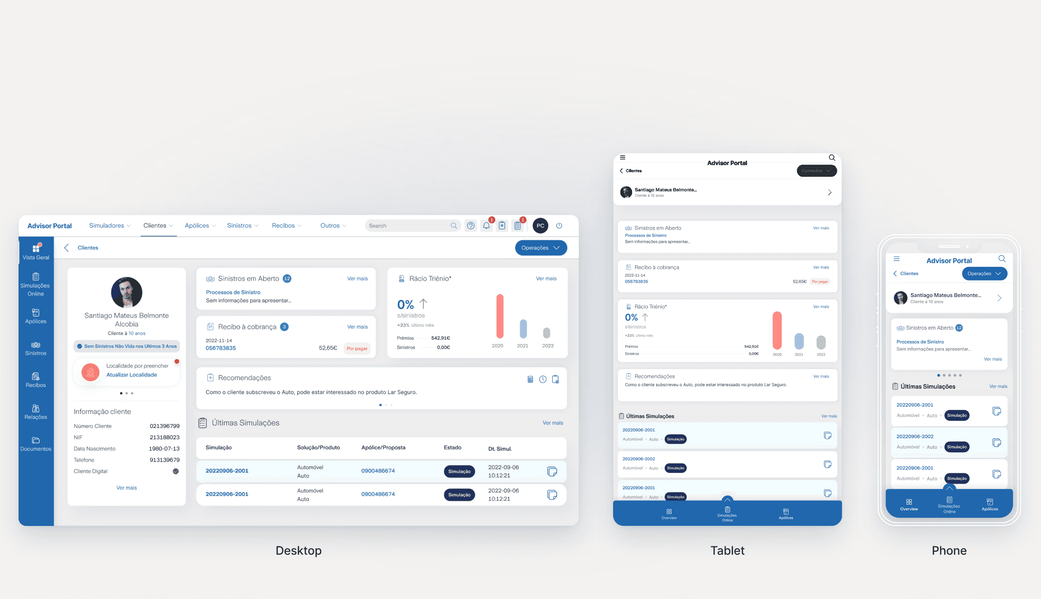
The client overview on desktop, tablet and phone, with layouts reordered around the task at each size

Only then did I draw the workflows at desktop, tablet and phone.
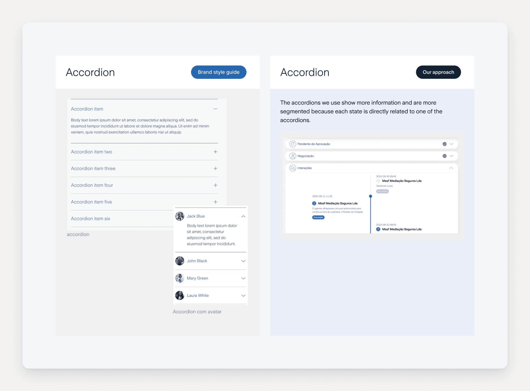
The brand style guide accordion next to the segmented accordion used in the product

04

Decisions

Decisions

Decisions

Responsive around task priority, not breakpoint reflow

Responsive around task priority, not breakpoint reflow

Responsive around task priority, not breakpoint reflow

The Tension

The fast path is to reflow desktop layouts down. Insurance workflows have a clear task order, and shrinking a desktop layout buries the primary action on smaller screens. Reworking priority per breakpoint costs more design time and more component variants.

The fast path is to reflow desktop layouts down. Insurance workflows have a clear task order, and shrinking a desktop layout buries the primary action on smaller screens. Reworking priority per breakpoint costs more design time and more component variants.

What I chose

Layouts adapt around what the user is trying to do at that size rather than around available width.

Layouts adapt around what the user is trying to do at that size rather than around available width.

What it cost

More variants to specify, document and build, and a slower handoff.

More variants to specify, document and build, and a slower handoff.

Interpret the brand system rather than reproduce it

Interpret the brand system rather than reproduce it

Interpret the brand system rather than reproduce it

The Tension

The insurer's design standards were built for brand surfaces, not for a dense internal application. Reproducing them faithfully was the defensible option and the quick one. Interpreting them meant departing from the client's own system in places, which is an awkward argument to make when the system belongs to the people you are presenting to.

The insurer's design standards were built for brand surfaces, not for a dense internal application. Reproducing them faithfully was the defensible option and the quick one. Interpreting them meant departing from the client's own system in places, which is an awkward argument to make when the system belongs to the people you are presenting to.

What I chose

I translated the design language into product components that hold the brand while working at operational density and across interaction states.

I translated the design language into product components that hold the brand while working at operational density and across interaction states.

What it cost

Every departure had to be justified to its owners. Working inside someone else's design system means the burden of proof sits with the change, not with the status quo, and some of those conversations took longer than the design work did.

Every departure had to be justified to its owners. Working inside someone else's design system means the burden of proof sits with the change, not with the status quo, and some of those conversations took longer than the design work did.

Build the system alongside the screens, not after them

Build the system alongside the screens, not after them

Build the system alongside the screens, not after them

The Tension

A component system is overhead until the design has settled, and the usual argument is to wait until the direction is stable so nothing gets built twice.

A component system is overhead until the design has settled, and the usual argument is to wait until the direction is stable so nothing gets built twice.

What I chose

I pulled recurring patterns into components and templates as the visual direction was validated, and documented states, responsive rules and edge cases for the build team.

I pulled recurring patterns into components and templates as the visual direction was validated, and documented states, responsive rules and edge cases for the build team.

What it cost

Some components were built before every edge case was known and had to be revised once later screens exposed the gaps. The first workflows moved slower than they would have as standalone designs, and the payback only arrived on the ones that came after.

Some components were built before every edge case was known and had to be revised once later screens exposed the gaps. The first workflows moved slower than they would have as standalone designs, and the payback only arrived on the ones that came after.

05

Solution

Solution

Solution

The application was rebuilt on one component library: twelve screen templates the team builds from, and every service moved onto them. The main workflows kept a single hierarchy across desktop, tablet and phone rather than three separate interpretations of it.
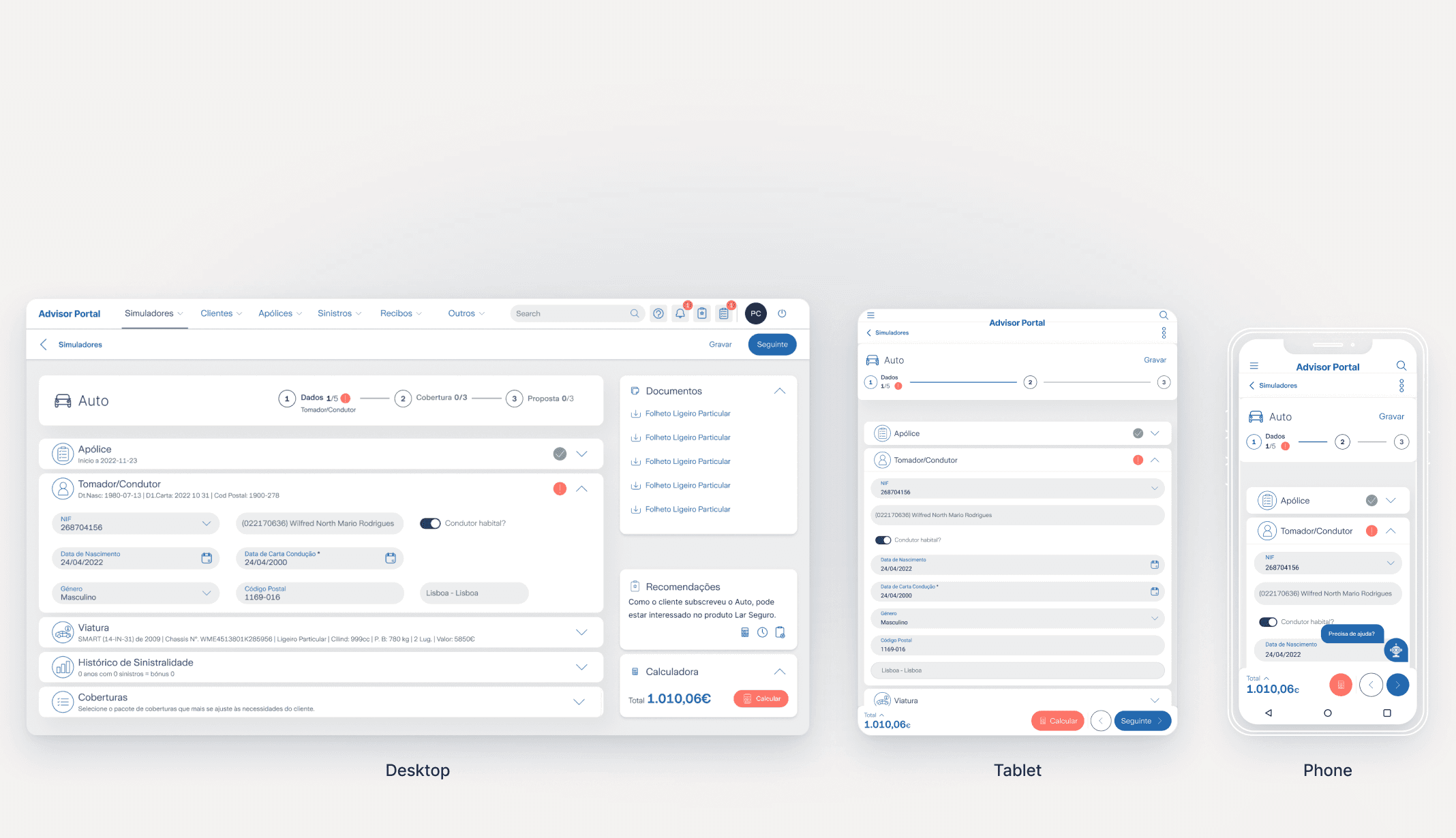
The car insurance simulator on desktop, tablet and phone

The system outlived the engagement: the client went on to commission two further applications designed on the same components. That is the only evidence I have that these decisions held after I handed them over, and it is the evidence I trust most.

Four key workflows with one hierarchy: clients, policies, a claim and receipts
The simulators catalogue on desktop and the car insurance simulator on a phone
Cover plans compared side by side on desktop and on a phone
The claims list and a single claim
The brand style guide wizard next to the denser version proposed for the product

06

Validation

Validation

Validation

HOW IT WAS REVIEWED

Reviewed with product stakeholders and developers throughout, with the resulting component library adopted by the implementation team. No advisor was ever in the room; the people in this project's title are people I never met. The recurring argument was not about the workflows but about taste: everyone had a personal opinion on the layout, and I had to say more than once that the decision belonged to the client's own standards rather than to the preference of whoever was in the meeting.

Reviewed with product stakeholders and developers throughout, with the resulting component library adopted by the implementation team. No advisor was ever in the room; the people in this project's title are people I never met. The recurring argument was not about the workflows but about taste: everyone had a personal opinion on the layout, and I had to say more than once that the decision belonged to the client's own standards rather than to the preference of whoever was in the meeting.

WHAT SHIPPED

Research, design system and mockups handed to the implementation team. Live.

Research, design system and mockups handed to the implementation team. Live.

07

Outcome

Outcome

Outcome

Every service in the application was rebuilt on the component library, and the client went on to commission further applications designed on the same system.

The redesign gave the application a consistent responsive experience, and gave the development team components and screen templates to build from instead of interpreting designs screen by screen. Recurring layouts stopped being redesigned per screen, and component behaviour, responsive rules and edge cases were specified rather than resolved during implementation.

I have no business figures from this project. Any the client holds are confidential.

+2

+2

+2

apps the client commissioned on the same system

12

12

12

screen templates the team builds from

100%

100%

100%

of services rebuilt on the component library

08

Reflection

Reflection

Reflection

A design system only pays off when it can be applied within a product and its technical environment.

I interpreted the established visual standards so they supported real insurance workflows, responsive behaviour and repeatable implementation.

Let’s build something meaningful.

Open to new challenges, to solving hard problems and to being part of something big. Permanent Lead or Senior Product Designer roles.

LOCATION

Azores, Portugal

LOCAL TIME

15:20AZOST

© 2026 André Duarte

Senior Product Designer

Azores, Portugal

Let’s build something meaningful.

Open to new challenges, to solving hard problems and to being part of something big. Permanent Lead or Senior Product Designer roles.

LOCATION

Azores, Portugal

LOCAL TIME

15:20AZOST

© 2026 André Duarte

Senior Product Designer

Azores, Portugal

Insurance

Enterprise Product

Under NDA

Clarifying insurance management for advisors

Clarifying insurance management for advisors

Clarifying insurance management for advisors

Clarifying insurance management for advisors

A reusable design foundation for an internal insurance application, created to improve consistency, responsive behaviour and implementation across customer and policy-related workflows.

A reusable design foundation for an internal insurance application, created to improve consistency, responsive behaviour and implementation across customer and policy-related workflows.

A reusable design foundation for an internal insurance application, created to improve consistency, responsive behaviour and implementation across customer and policy-related workflows.

A reusable design foundation for an internal insurance application, created to improve consistency, responsive behaviour and implementation across customer and policy-related workflows.

Role

Senior Product Designer

Disciplines

Product Design, UX, UI and Design Systems

Client

Multinational insurer

Platform

Web & Mobile

01

Overview

Overview

Overview

The project focused on redesigning an internal application used by insurance professionals at a multinational insurer to manage customer information and insurance-related workflows.

The existing product required a more consistent and responsive experience that matched the organisation’s wider design standards. Alongside the application redesign, the work included translating the organisation’s established design language into reusable components and screen patterns suitable for implementation within the product’s development environment.

I owned the redesign and the component library that came out of it, and I worked directly with the developers who implemented it.

Certain product details, internal workflows and interface examples have been adapted or omitted to respect confidentiality obligations.

02

Challenge

Challenge

Challenge

The application needed to support a wide range of operational workflows while maintaining a coherent experience across different sections and devices.

Inconsistent interface patterns made it more difficult to preserve brand alignment, maintain predictable interactions and scale the product efficiently as new screens and capabilities were introduced.

The development team also needed a practical way to apply the organisation’s existing design standards within the product’s technical environment. Without a shared component foundation, individual screens risked being implemented differently, which meant more design and development effort.

The project needed to establish a responsive and reusable system that could improve the immediate product experience while supporting faster and more consistent future delivery.

Detailed internal workflows, technical decisions and stakeholder requirements cannot be disclosed.

03

Process

Process

Process

I started with the style guide, not the screens. Nothing could be laid out until the sizes were settled, and the brand's didn't transfer: its default button was 56px tall with 18px text. I remapped the scale instead. The smallest brand size became the product default, one size was dropped, and I added a 32px variant for tables.

The brand style guide buttons next to the sizes proposed for the product

The same held component by component. The brand accordion held body text; in the product, an accordion was a stage of a case, carrying its own status and the interaction history inside it. I worked through them as side-by-side sheets (their component, mine, and the reason for the difference written beside it).

The client overview on desktop, tablet and phone, with layouts reordered around the task at each size

Only then did I draw the workflows at desktop, tablet and phone.

The brand style guide accordion next to the segmented accordion used in the product

04

Decisions

Decisions

Decisions

Responsive around task priority, not breakpoint reflow

Responsive around task priority, not breakpoint reflow

Responsive around task priority, not breakpoint reflow

The Tension

The fast path is to reflow desktop layouts down. Insurance workflows have a clear task order, and shrinking a desktop layout buries the primary action on smaller screens. Reworking priority per breakpoint costs more design time and more component variants.

The fast path is to reflow desktop layouts down. Insurance workflows have a clear task order, and shrinking a desktop layout buries the primary action on smaller screens. Reworking priority per breakpoint costs more design time and more component variants.

What I chose

Layouts adapt around what the user is trying to do at that size rather than around available width.

Layouts adapt around what the user is trying to do at that size rather than around available width.

What it cost

More variants to specify, document and build, and a slower handoff.

More variants to specify, document and build, and a slower handoff.

Interpret the brand system rather than reproduce it

Interpret the brand system rather than reproduce it

Interpret the brand system rather than reproduce it

The Tension

The insurer's design standards were built for brand surfaces, not for a dense internal application. Reproducing them faithfully was the defensible option and the quick one. Interpreting them meant departing from the client's own system in places, which is an awkward argument to make when the system belongs to the people you are presenting to.

The insurer's design standards were built for brand surfaces, not for a dense internal application. Reproducing them faithfully was the defensible option and the quick one. Interpreting them meant departing from the client's own system in places, which is an awkward argument to make when the system belongs to the people you are presenting to.

What I chose

I translated the design language into product components that hold the brand while working at operational density and across interaction states.

I translated the design language into product components that hold the brand while working at operational density and across interaction states.

What it cost

Every departure had to be justified to its owners. Working inside someone else's design system means the burden of proof sits with the change, not with the status quo, and some of those conversations took longer than the design work did.

Every departure had to be justified to its owners. Working inside someone else's design system means the burden of proof sits with the change, not with the status quo, and some of those conversations took longer than the design work did.

Build the system alongside the screens, not after them

Build the system alongside the screens, not after them

Build the system alongside the screens, not after them

The Tension

A component system is overhead until the design has settled, and the usual argument is to wait until the direction is stable so nothing gets built twice.

A component system is overhead until the design has settled, and the usual argument is to wait until the direction is stable so nothing gets built twice.

What I chose

I pulled recurring patterns into components and templates as the visual direction was validated, and documented states, responsive rules and edge cases for the build team.

I pulled recurring patterns into components and templates as the visual direction was validated, and documented states, responsive rules and edge cases for the build team.

What it cost

Some components were built before every edge case was known and had to be revised once later screens exposed the gaps. The first workflows moved slower than they would have as standalone designs, and the payback only arrived on the ones that came after.

Some components were built before every edge case was known and had to be revised once later screens exposed the gaps. The first workflows moved slower than they would have as standalone designs, and the payback only arrived on the ones that came after.

05

Solution

Solution

Solution

The application was rebuilt on one component library: twelve screen templates the team builds from, and every service moved onto them. The main workflows kept a single hierarchy across desktop, tablet and phone rather than three separate interpretations of it.

The car insurance simulator on desktop, tablet and phone

The system outlived the engagement: the client went on to commission two further applications designed on the same components. That is the only evidence I have that these decisions held after I handed them over, and it is the evidence I trust most.

Four key workflows with one hierarchy: clients, policies, a claim and receipts
The simulators catalogue on desktop and the car insurance simulator on a phone
Cover plans compared side by side on desktop and on a phone
The claims list and a single claim
The brand style guide wizard next to the denser version proposed for the product

06

Validation

Validation

Validation

HOW IT WAS REVIEWED

Reviewed with product stakeholders and developers throughout, with the resulting component library adopted by the implementation team. No advisor was ever in the room; the people in this project's title are people I never met. The recurring argument was not about the workflows but about taste: everyone had a personal opinion on the layout, and I had to say more than once that the decision belonged to the client's own standards rather than to the preference of whoever was in the meeting.

Reviewed with product stakeholders and developers throughout, with the resulting component library adopted by the implementation team. No advisor was ever in the room; the people in this project's title are people I never met. The recurring argument was not about the workflows but about taste: everyone had a personal opinion on the layout, and I had to say more than once that the decision belonged to the client's own standards rather than to the preference of whoever was in the meeting.

WHAT SHIPPED

Research, design system and mockups handed to the implementation team. Live.

Research, design system and mockups handed to the implementation team. Live.

07

Outcome

Outcome

Outcome

Every service in the application was rebuilt on the component library, and the client went on to commission further applications designed on the same system.

The redesign gave the application a consistent responsive experience, and gave the development team components and screen templates to build from instead of interpreting designs screen by screen. Recurring layouts stopped being redesigned per screen, and component behaviour, responsive rules and edge cases were specified rather than resolved during implementation.

I have no business figures from this project. Any the client holds are confidential.

+2

+2

+2

apps the client commissioned on the same system

12

12

12

screen templates the team builds from

100%

100%

100%

of services rebuilt on the component library

08

Reflection

Reflection

Reflection

A design system only pays off when it can be applied within a product and its technical environment.

I interpreted the established visual standards so they supported real insurance workflows, responsive behaviour and repeatable implementation.

Let’s build something meaningful.

Open to new challenges, to solving hard problems and to being part of something big. Permanent Lead or Senior Product Designer roles.

LOCATION

Azores, Portugal

LOCAL TIME

15:20AZOST

© 2026 André Duarte

Senior Product Designer

Azores, Portugal