Healthcare
Enterprise Product
Under NDA
Role
Senior Product Designer
Disciplines
Product Design, UX, UI, Prototyping, Design Systems
Client
Global medical devices
Platform
Web & Mobile

01
A large medical technology provider wanted to improve how hospitals educate and guide patients through complex medical procedures. Their existing digital platform was difficult to scale, inconsistent across hospitals, and not fully optimised for accessibility or modern usability standards.
The goal was to redesign the platform into a more flexible, modular solution that could adapt to different hospital needs and still comply with privacy and security regulations.
I led the UX and UI redesign, defining a scalable system that improved usability across mobile and desktop and made the experience more reassuring for patients and for the clinicians supporting them.
02
Undergoing a medical procedure can be overwhelming. Patients often feel lost, unsure about what will happen, how to prepare, or what recovery will look like. The information they receive is usually scattered across pamphlets, emails, and hospital portals that feel more clinical than comforting.
The existing digital tool was meant to guide patients through this process, but it fell short. It was confusing to navigate and lacked a sense of reassurance. It added to their anxiety.

Hospitals, too, felt the strain. They needed a reliable way to communicate with patients that met strict privacy and security standards. But the system’s rigid structure made it hard to adapt across different hospital workflows or patient needs.
03
The research gave me three personas: two patients facing different procedures, and a caregiver acting on someone else's behalf. I built those before any screen, because the first release had to be scoped to what the three had in common. One need was starred on all three boards: the order of things. Everything else belonged to one of them and not the others.
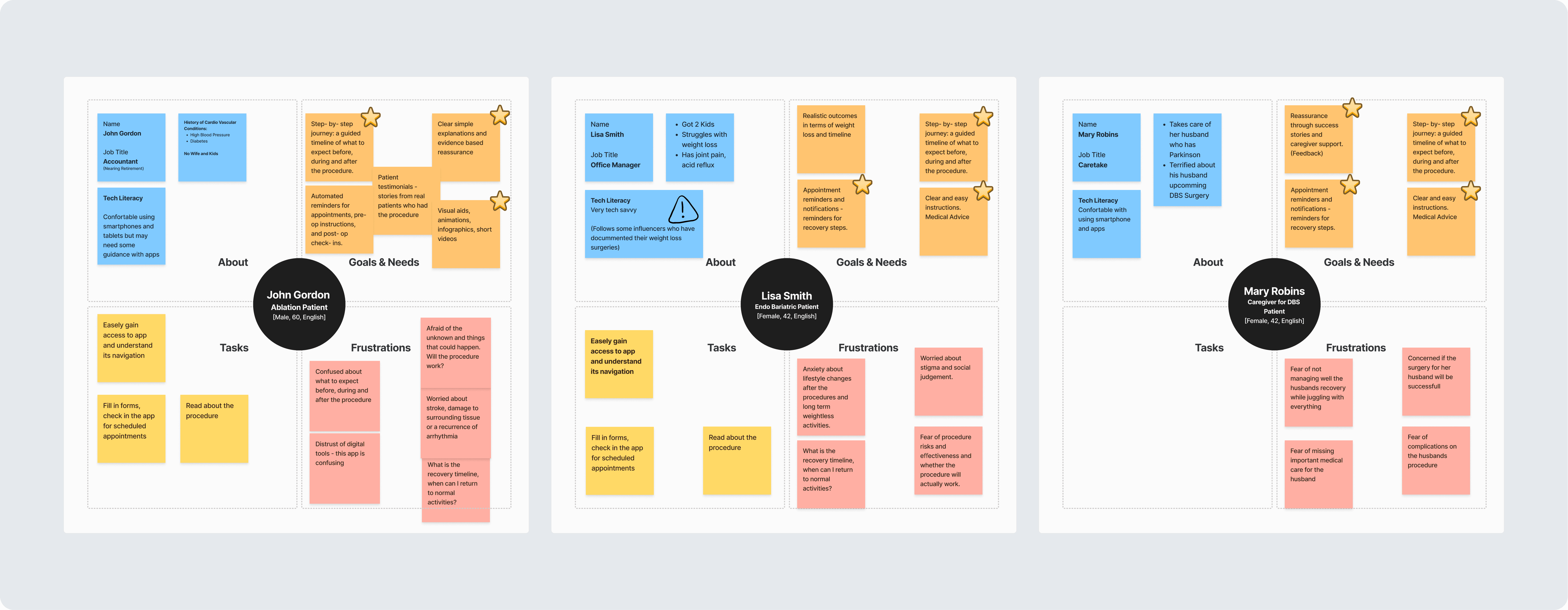
Their frustration columns were almost all fear: of the unknown, of recovery, of missing something. One note across the three boards was about the tool itself. I had been briefed on usability.
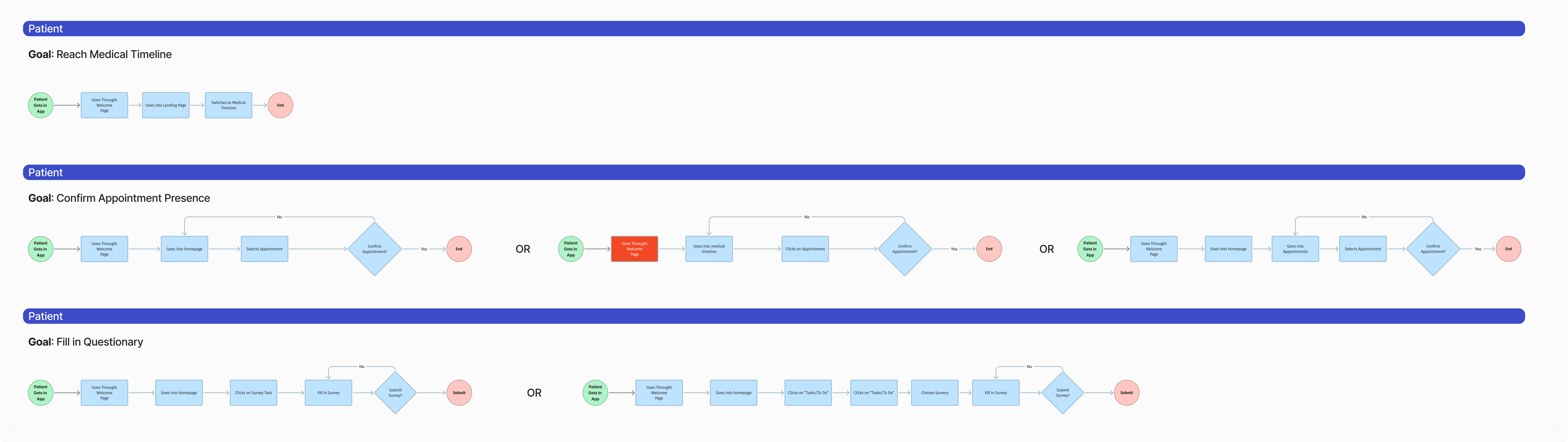
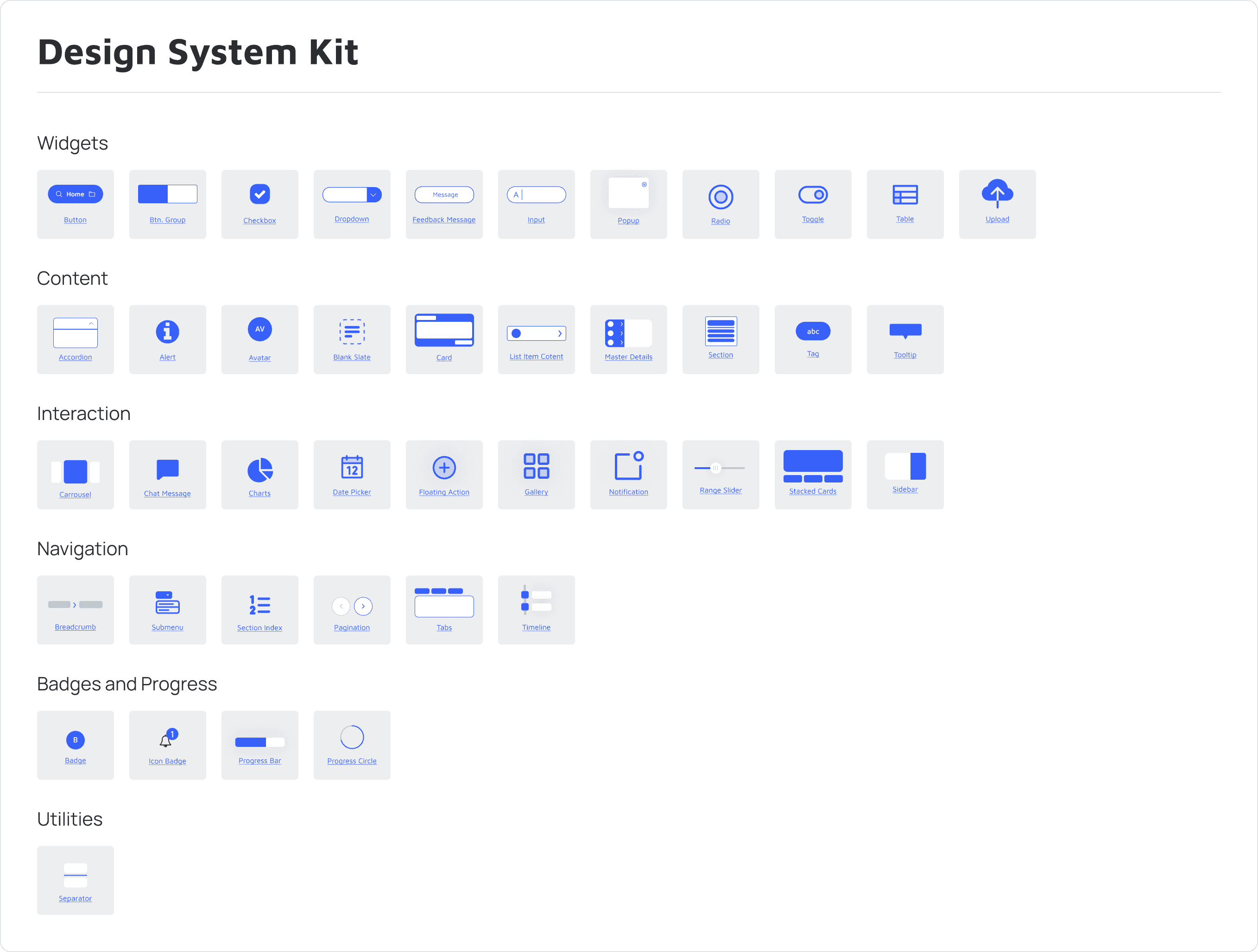
I mapped each goal as a flow, including the routes where the answer is no, and built the component kit alongside the screens: around forty pieces, notifications, progress and empty states among them.
04
The Tension
What I chose
What it cost

The Tension
What I chose
What it cost

The Tension
What I chose
What it cost

05
The interface could change; the application behind it could not. The scope was fixed before I arrived. So the redesign came out of sequence, structure and register. I redrew the screens for phone and desktop.
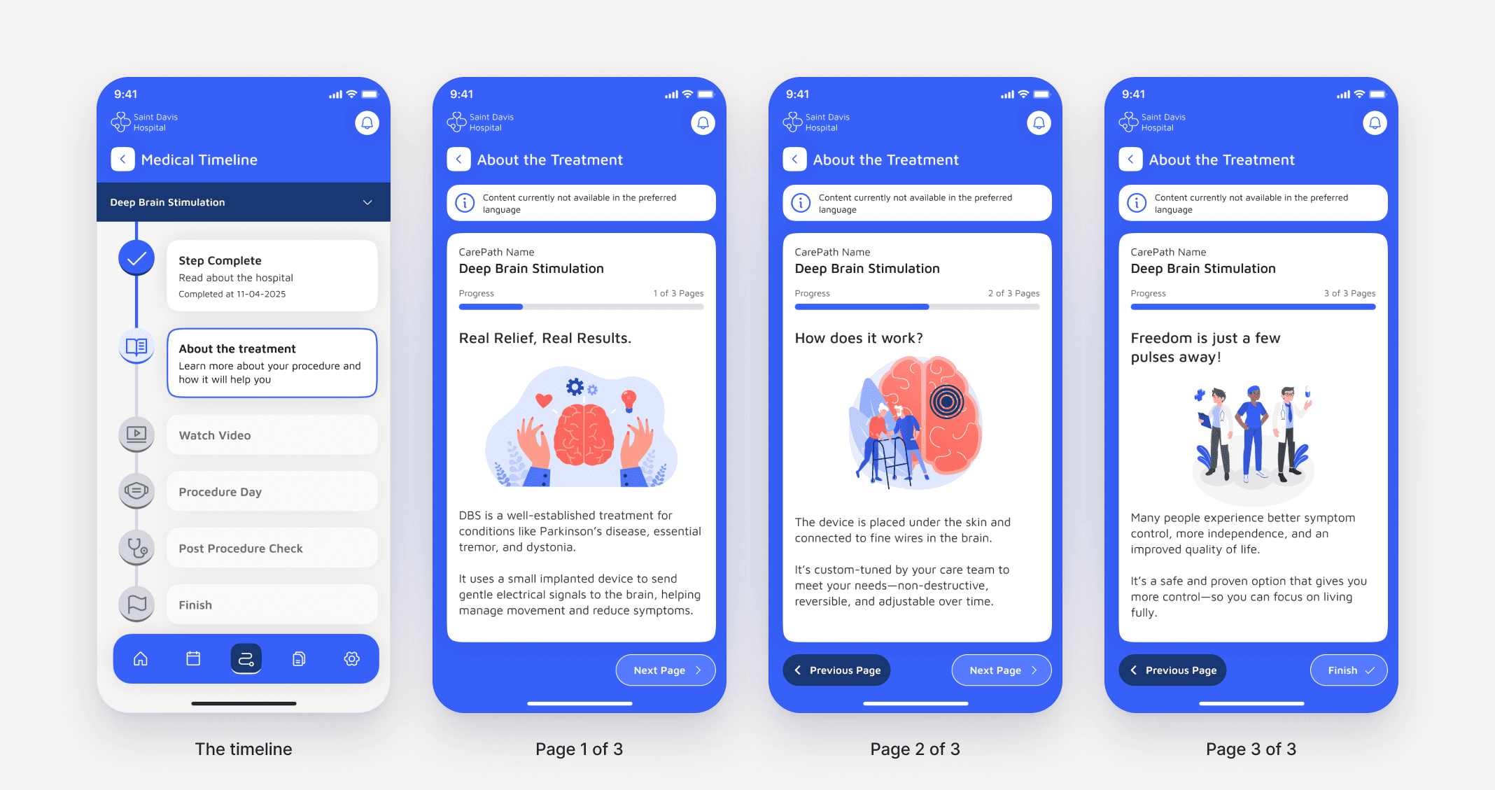
Guided patient experience: One timeline carries the whole procedure; the steps ahead stay greyed until the patient reaches them.
Three adoption levels: a hospital picks one of them, and each has a fixed feature set.
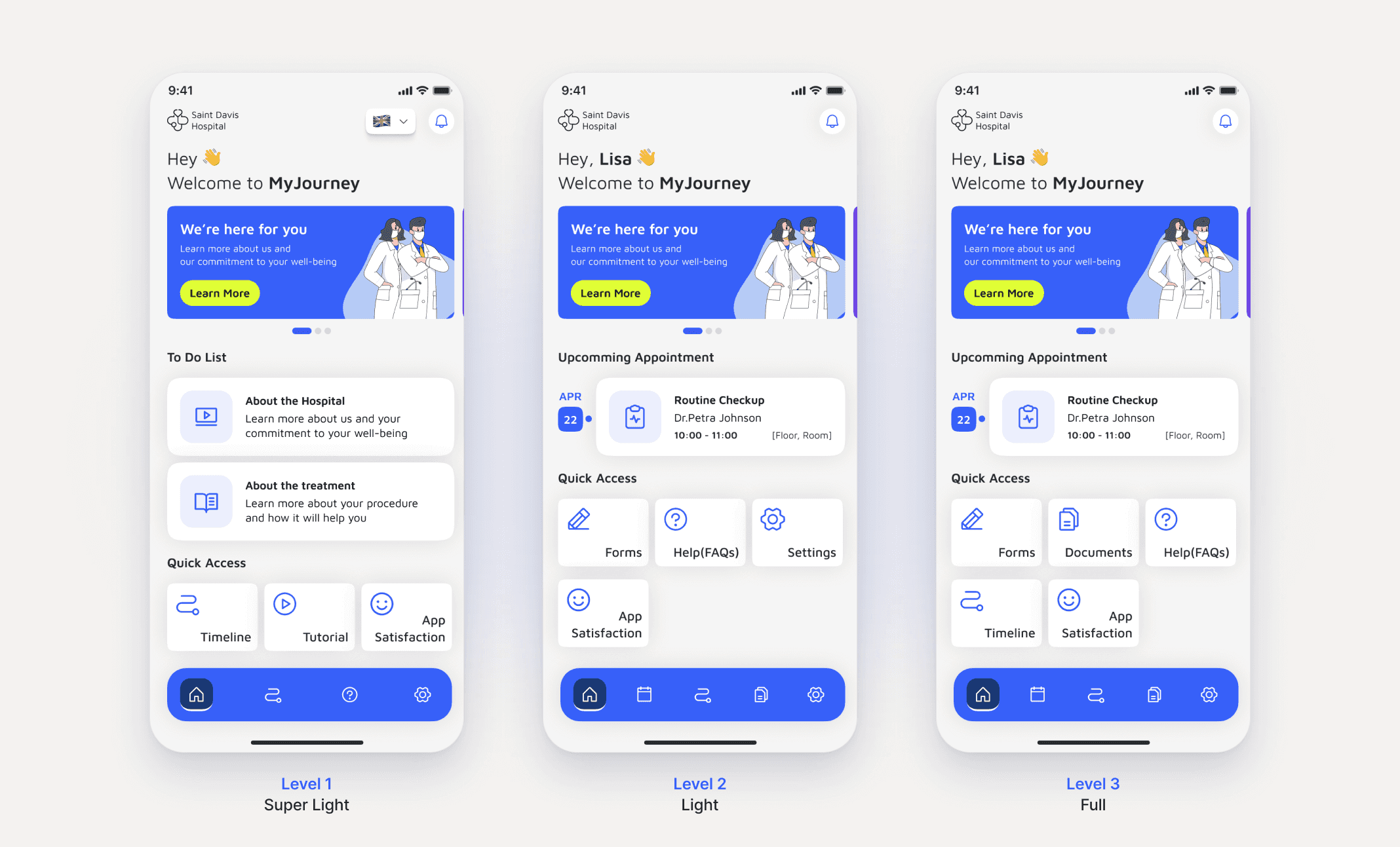
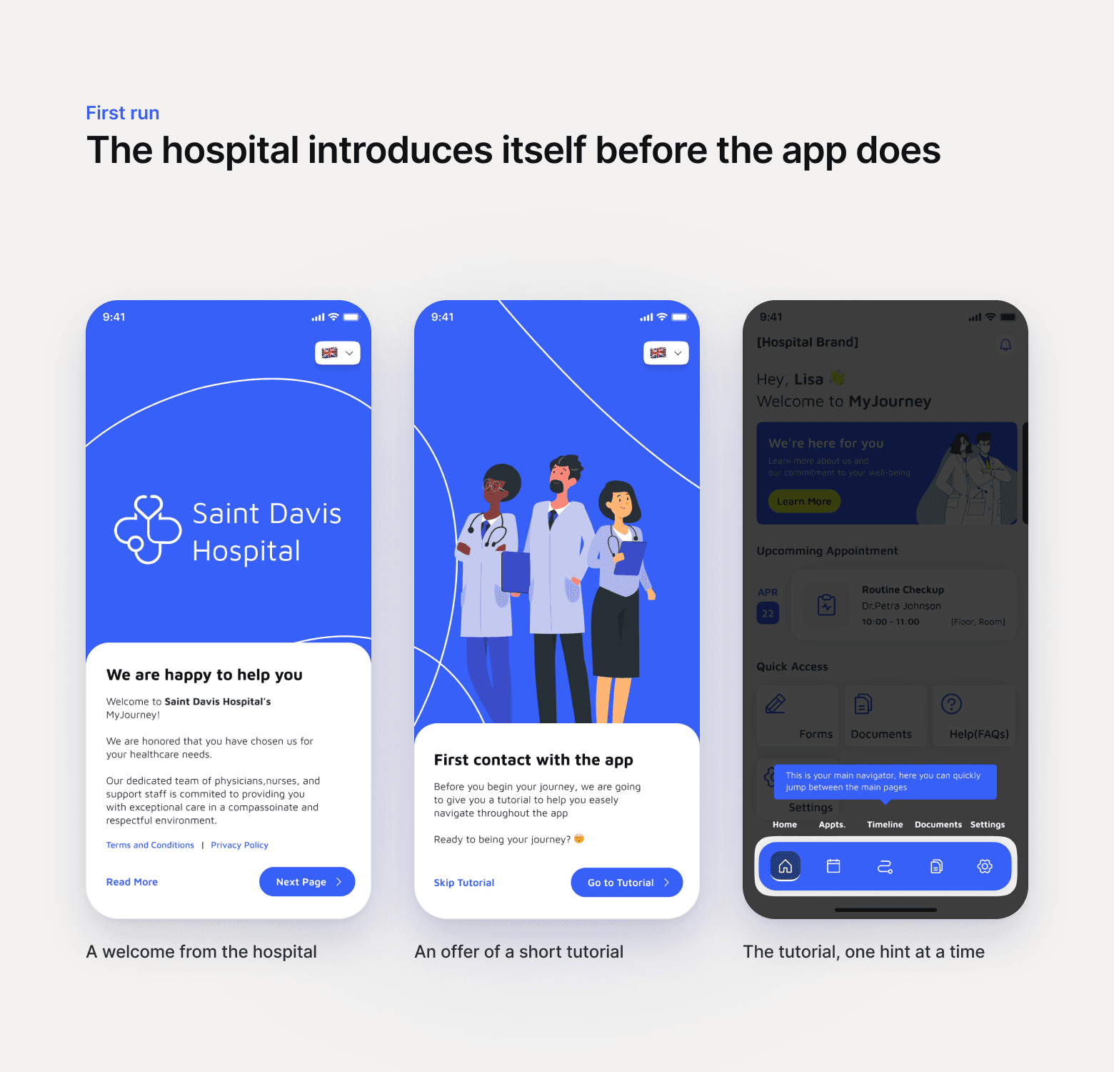
Treatment content paced over three pages rather than one text-heavy screen. Appointments were added so patients can keep track of their schedules; documents and help sit alongside them on the home screen.
Accessibility and compliance: privacy, security and accessibility sat in the brief rather than at the end of it: a patient population spanning a wide age range, content legal and clinical teams had already approved, and one experience that had to hold across every hospital on the platform.




06
HOW IT WAS REVIEWED
WHAT SHIPPED
07
The client reported that patients now go into a procedure markedly less anxious than they did with the tool this replaced. That's their assessment relayed to me, not a figure I measured.
Three adoption levels shipped, so a hospital can take on the platform at a level matching its digital readiness. The design system built alongside it gave the client a consistent foundation for the products that followed. The product stopped being a repository patients had to search and became a sequence that meets them at each stage of the procedure.
Outcomes were not measured with patients during my involvement, and any figures the client holds are covered by the agreement.
tiers, matched to each hospital's digital readiness
components handed over, with their states
08
The hardest part of this project was not the interface. It was accepting that the product's real failure was emotional rather than functional. The original tool was complete and accurate, and patients still finished it feeling worse than when they started.
Designing for reassurance in a regulated environment means working inside content that legal and clinical teams have already approved, so most of the work sat in sequence and pacing rather than in wording. Deciding what a patient sees at which moment did more for confidence than any visual change.
What I would change is access. I validated the work with clinical specialists, hospital administrators and the client's product team, all of whom knew the domain deeply. None of them were patients. I would push harder for direct contact with the people the product is actually for, even in an environment where arranging that is genuinely difficult.